Deadzone Awareness Campaign
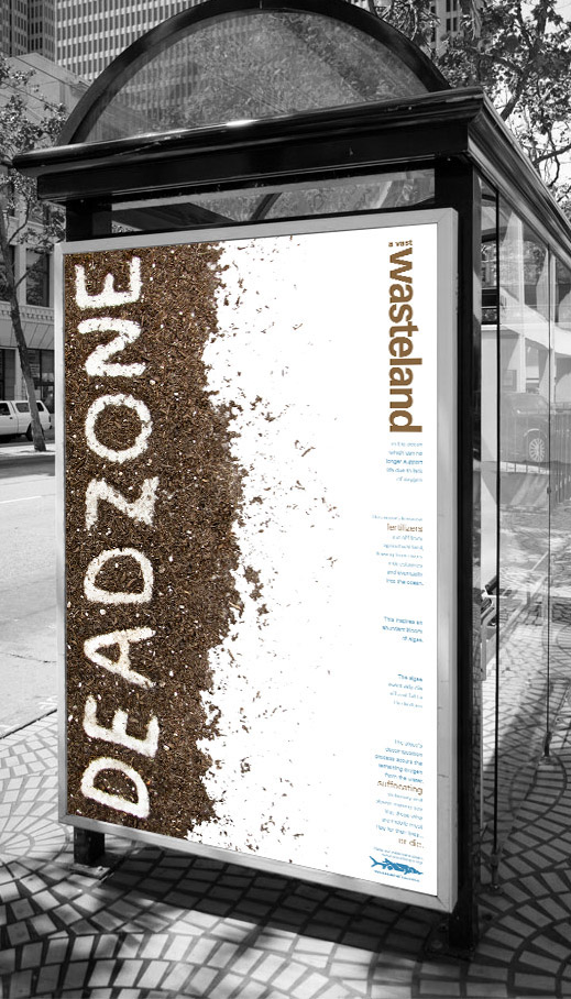
I started this typography challenge with creating many different conceptual hand-made expressive words that had to deal with political or environmental issues in the world. After conducting research I found out about the major issue of dead zones and how human impact causes these hypoxic areas in the ocean. I presented the idea in class and many of my fellow students advised me they were unaware of this global issue. It seems important that more people be educated about this problem so they can understand how human habitation affects the beautiful ocean and the creatures that live in it. I conceptualized the use of negative space as a “dead zone” itself and implemented it by writing the word using soil as the medium and concrete as the canvas. The dirt is intended to represent the source of fertilizers, one of the major causes of dead zones in the ocean. The bold word is intended to catch the attention of the audience, and draw people in the find out more. I used natural tones of brown and blue to capture the organic subject matter. I applied the design to a flyer, bus shelter and bus wrap in an effort to create graphics that would further promote awareness.